Metrics
Metrics is the screen for "how are we doing", as opposed to the dashboard's "what is on the pile right now".
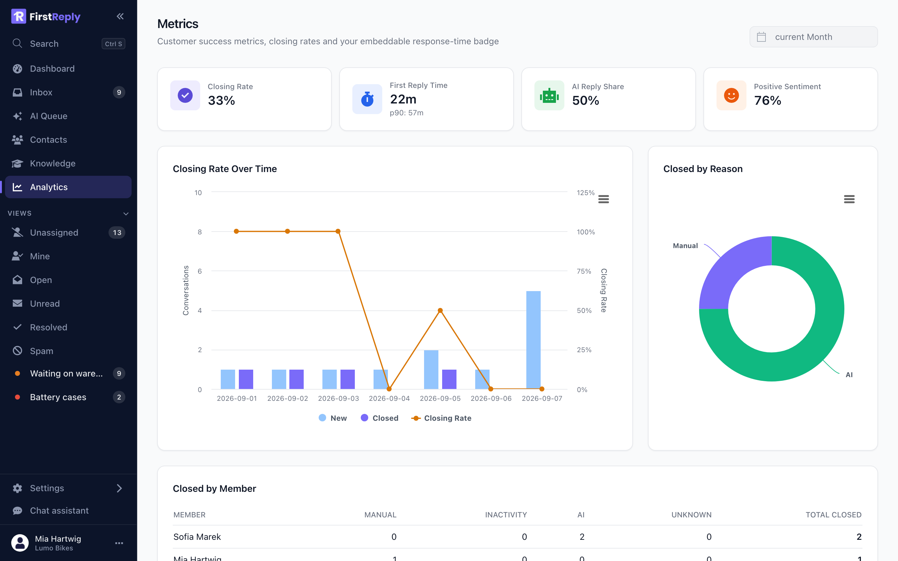
Open it from Analytics in the sidebar. The period selector at the top applies to everything below it.
The four headline numbers
Closing rate — the share of conversations in the period that were closed. It measures throughput, not quality, and it is easy to inflate by closing things that are not finished. Read it next to the reopen rate.
First reply time — the median wait from a customer's message to your first reply, with the 90th percentile underneath. The p90 is the number that describes the experience of the customers who had the worst time, and it is the one automation improves most.
AI reply share — the share of conversations the assistant answered. It is how much work is being absorbed. On its own it means nothing: a high share with falling sentiment is worse than a low share.
Positive sentiment — the share of customer messages the assistant read as positive. It is the closest thing here to a satisfaction score, and its direction matters far more than its absolute value.
Closing rate over time
New and closed conversations per day with the closing rate over them.
The shape to look for is the two bar series tracking each other. When new consistently exceeds closed, the backlog is growing regardless of what the headline numbers say.
A closing rate above 100% on a given day is not a bug: conversations closed that day can have been opened earlier.
Closed by reason
Manual, AI and inactivity, as a share of everything closed.
Manual — a person closed it.
AI — the assistant answered and closed it, in a category with automatic close on.
Inactivity — the workspace rule closed it after a period of silence.
A growing AI slice with steady sentiment is automation working. A growing inactivity slice is worth a second look: conversations closing by timeout often means they were never really answered.
Closed by member
A table of who closed how many, split by reason.
Read it as a distribution rather than as a scoreboard. What is worth noticing is the shape: everything closing through one person is a bus factor, and someone closing nothing may be handling the hard cases that stay open.
Reading them together
The pairs, not the singles:
| Pattern | What it means |
|---|---|
| AI share up, sentiment steady | Automation is working. Widen carefully |
| AI share up, sentiment down | Answering more and answering worse. Narrow the categories or raise the confidence threshold |
| Closing rate up, reopens up | Closing rather than resolving |
| First reply time down, sentiment steady | The routine questions are being absorbed. This is the main win |
| Inactivity closes rising | Conversations are timing out rather than being answered |
Reviewing quality turns these into a weekly routine and maps each symptom to where the fix belongs.
The response time badge
The metrics page also provides an embeddable badge showing your typical response time, for your own website. It updates from the same data as the first reply time above, so it cannot drift from reality.